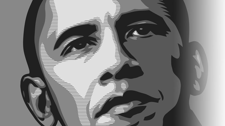
During the 2008 presidential campaign, Barack Obama wasn’t just a politician. He was a brand.
And like any successful brand, Obama’s campaign used a cohesive visual identity to woo its customers—in this case, voters.

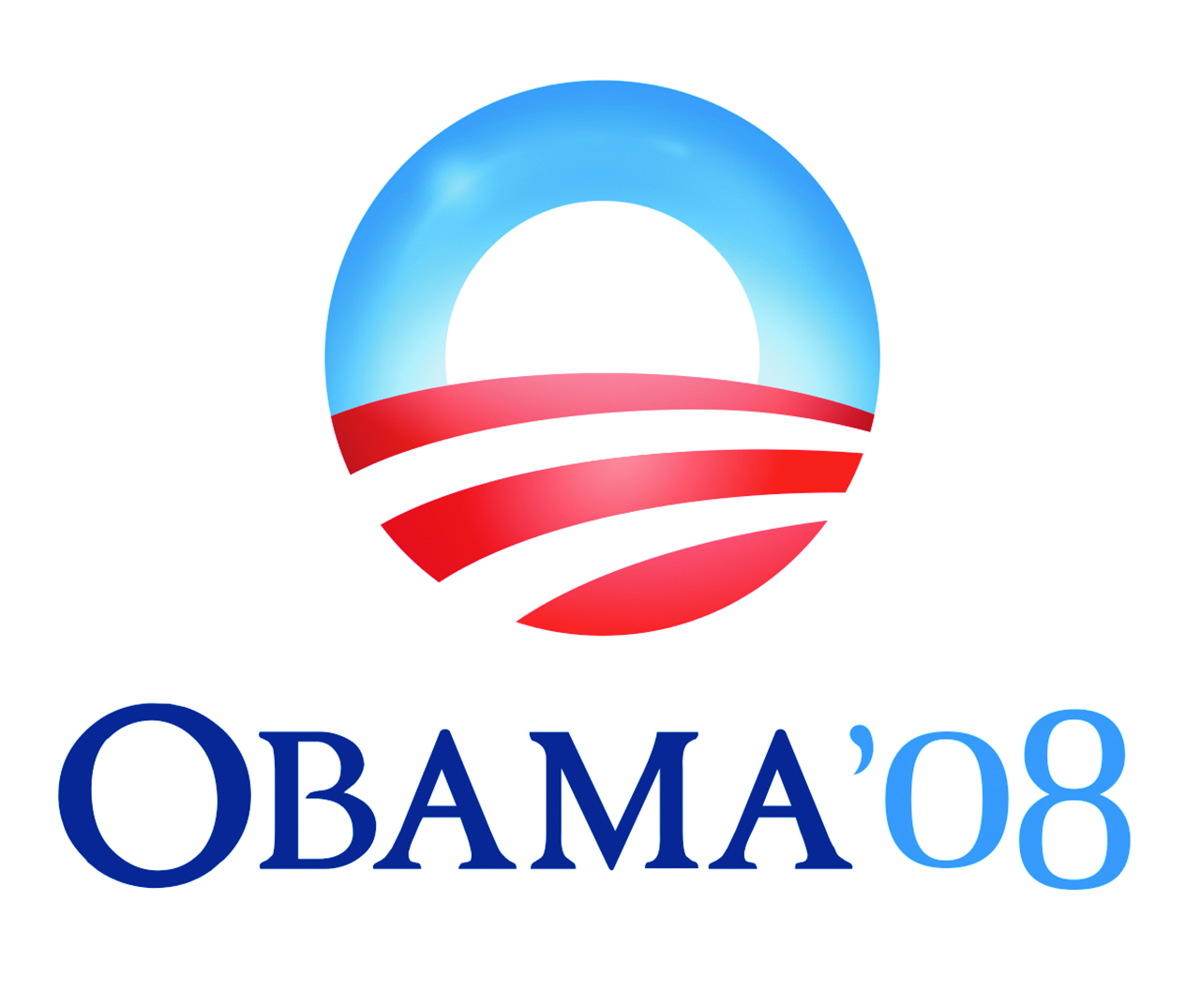
Obama portrayed himself as the candidate of the future through the iconic “HOPE” image created by artist Shepard Fairey and the use of the fresh-but-credible Gotham font and sunrise logo in campaign materials. Obama was named Advertising Age’s Marketer of the Year in 2008.
A political campaign’s logo, font, and other visual cues are overt and covert psychological and communication strategies, expressed visually, said John Walker, a graphic designer and recently retired director of Illinois State University’s arts technology program.
“I don’t think design can make or break a campaign, but it is an essential ingredient in the ‘stew’ that forms the electorate’s impression of the candidate,” said Rick Valentin, assistant professor of arts technology.
In the following sections, Walker and Valentin unpack the hidden meanings behind current and past campaign imagery.
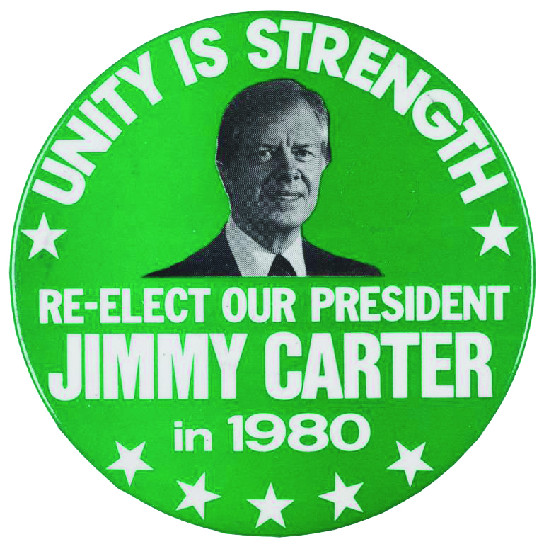
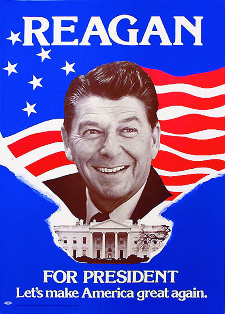
Reagan vs. Carter
Looking at two rival campaigns’ imagery side-by-side can also reveal hidden
messages.
In 1980 incumbent Democrat Jimmy Carter faced Republican challenger Ronald Reagan. Carter’s campaign stuck with the green color scheme used in his outsider, post-Watergate 1976 campaign, rather than the customary red-white-blue you might expect from an incumbent. The Reagan campaign staked out blue as its color, which echoed the country’s refreshed and restored patriotism, Valentin said.
“In an interesting twist, embracing conservative design choices and a conservative political perspective represented the voice of change (for Reagan),” said Valentin.
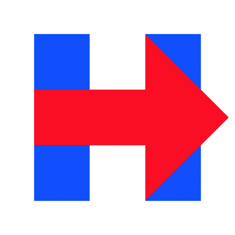
Hillary Clinton
Clinton’s arrow logo has won praise for its versatility—it’s used in all sorts of ways, like the logo on Google’s home page—and because it points to “moving forward.” It’s also bold for what it’s missing: her name.
“This is likely to avoid the ‘Do we really need another Clinton presidency?’ critique,” Walker said.
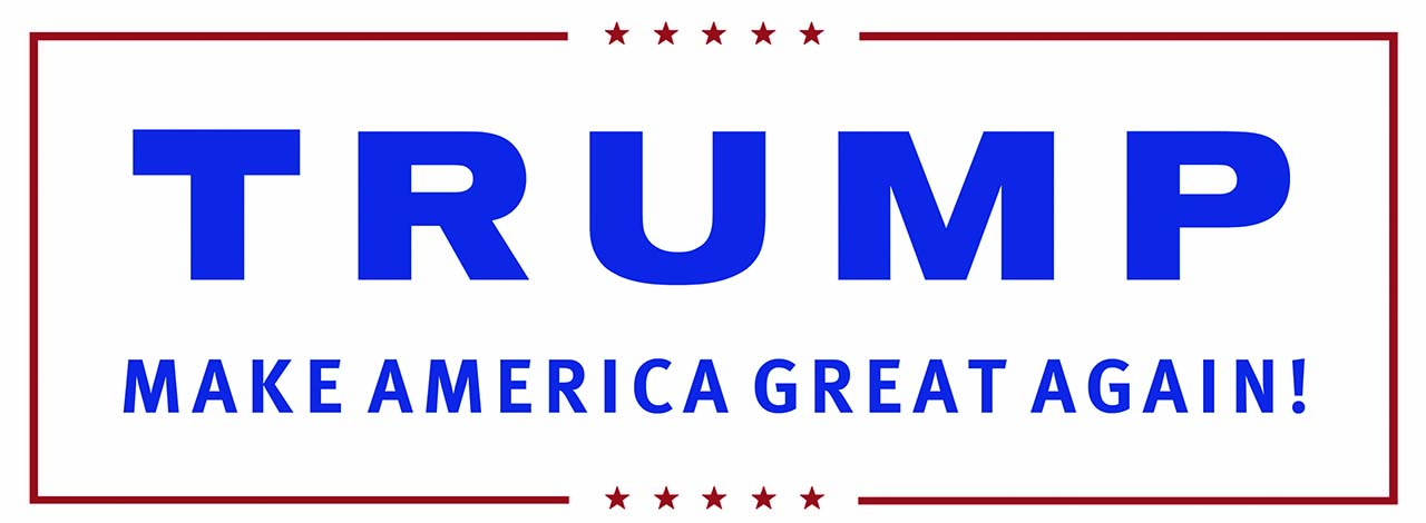
Donald Trump
Unlike his flamboyant campaign, Trump’s official logo is rather plain and uses a sans serif font.
“This simple use of blocky sans serif is about as boring as you can get,” Walker said.
“Early on in the primary process, Trump invested very little money in promoting his campaign, preferring to build awareness through social media and controversial statements that would garner free exposure through traditional media,” Valentin said.
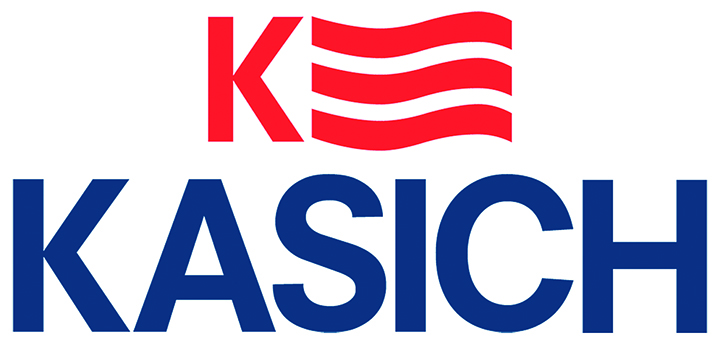
John Kasich
Lacking the celebrity status of Clinton or Trump, the Ohio governor’s campaign logo was purposeful.
“The uppercase spelling of KASICH below the K/flag spells out the candidate’s name, which is important here since not many national voters knew who he was when he entered the race,” Walker said.
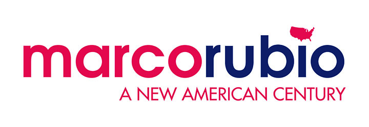
Marco Rubio
The Florida senator caught some heat when he unveiled his logo because the U.S. map that dots the “i” in his last name is missing Alaska and Hawaii.
At first glance the lowercase and sans serif font together broadcast the image of a young, modern, forward-looking candidate. But this font’s rounded shapes actually make it sort of a throwback.
“It’s supposed to represent the 21st century, but it reminded me of a ’70s political campaign graphic,” Valentin said.
